React Security Quiz
A quiz whose goal is to make users think about digital security habits introspectively, then give them information to change weak habits.
Date: 10-01-2016
Tech I Worked With: HTML, CSS, ReactJS
Responsibilities: Original Concept, Front-End Development, Design
Type: Project
Project Links:
GitHub Repository
Web App

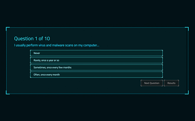
The quiz contains questions that ask users about their online habits. This forces more introspection, instead of just telling them if they do or don't know something. Questions are scored according to how much of a security risk they are introducing into their lives.

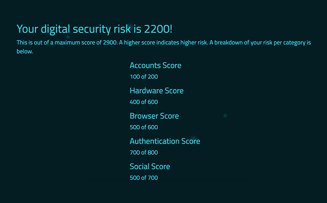
Results are broken down into categories so that users can see what areas they need to improve the most. A larger number means the user has higher security risks that are introduced through their digital habits.

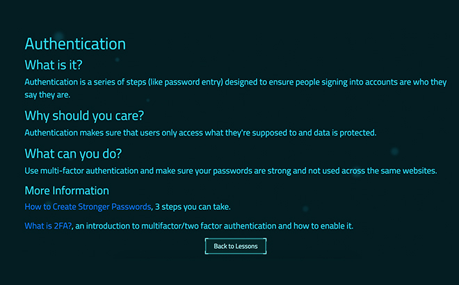
Lessons for each category break up subjects into quick bite-sized lessons. Each lesson contains links to other websites where users can take action and improve their digital habits.
Background Information
We have found technology embedded in every facet of our lives.. Everything from work to play to family and beyond has been affected both positively and negatively by technology’s influence. But despite this massive and personal integration, it’s surprising how many people have no idea what is running underneath the surface to make these technologies function1. The general public needs to learn about the technologies we use, how they will affect people in the long run, and how to develop habits that secure more privacy in our futures.
One of the largest problems I find to be present when explaining the importance of safeguarding your personal data is a large sense of apathy. After all, billions of people use the internet. So why should someone care if the chances of being personally examined are low?
Automation
With machine learning models increasing in complexity and various third parties having the ability to segment further and further, the ability to target an individual with specific messaging gets easier and easier. This could be messaging from commercial reasons (having someone want to buy a product) to political reasons (showing content that incites someone to act or shifts opinions). Perhaps the scariest thing is that people aren’t seen as individuals anymore with that level of automation and lack of human input.
Awareness and Action
While it’s very difficult to make an impact on the systems that have been put in place that allow the above to happen, being aware that this is taking place and what options one has to control the scope of effects gives one an immense amount of power. Essentially, choosing the option to shift daily habits and creating a more secure lifestyle is the best way to improve one’s control. Given the fact that many habits are relatively simple to implement once set up, it also allows people to have large impact with low effort.
Project Concept
In an effort to increase both awareness and action, my project has two main sections that enforce each of these ideas.
- The Quiz section is a questionnaire that asks someone questions about their current technology usage habits and routines.
- The Lessons section provides brief primers on what various topics covered in the quiz are and how someone can make use of that technology (installing software, making a schedule to do something, etc.).
I value practical things, and hope that my project can give people immediately useful information.
Scope and Focus
This project had a few constraints that would have a major impact in how scope and focus was decided:
- It had to be done in time for the Senior Showcase for Digital Media and Design majors.
- It had to be done by one person (me).
- Animation/motion had to be involved in some way.
The focus of the project itself kept going through various iterations until it was ultimately simplified.
Interactivity
The current app’s interactivity mostly just extends to clicking buttons. Originally, the plan was to be more immersive and have the user experience results of a data breach. However, this proved to be too difficult to achieve with the timeframe and manpower available. Writing an entire script and potentially even storyboard would have been required, and I simply don’t have much experience in either of those departments. Additionally, I was using this project as an excuse to focus on developing my development skills, and an interactive experience with that scope would have forced time to be distributed away from development.
Target audience
The current app is targeted towards someone who regularly uses technology, but doesn’t make conscious choices about their usage. Target audience shapes much of how the app is crafted. From size of targets to click, to how questions are worded, even reaching into development with the proportion of time spent on accommodating assistive technology. The original plan was to exclusively target populations of people who were older and only started using technology later in life. However, due to my desire for slightly more complex questions and feelings that a more tech savvy audience would create a larger impact, I opted to shift that focus.
Quiz style and question types
The current app uses a linear 10 question quiz with multiple choice questions. Other considerations have included…
- Questions that allowed the user to select multiple answers
- Questions that would conditionally show up depending on answers to others
- A quiz that was a test of security knowledge instead of a questionnaire about the user’s habits
I decided that a questionnaire about user habits would allow them to examine their own choices instead of just getting a “pass” or “fail” on a question. Additionally, the limit of 10 questions was used to make sure that people didn’t get bored of answering and leave the quiz without completing it.
Visual Theme
The visual theme came to be how it is for a few reasons.
- It doesn’t require any illustration. (I am not an illustrator.)
- There was a system (ARWES) that already worked with the development framework I had chosen.
- The aesthetic is meaningful.
The theme was inspired by the cyberpunk genre (which includes notable works like The Matrix and Ghost in the Shell). The visuals are both flashy and dark, a great parallel to how technology is both useful and something people have reason to be worried about. The genre as a whole focuses on thinking critically about technology, which is also what this project aims to help people do.
Development Choices
Unlike my other project that was completed for the Senior Showcase, this project neither requires a database nor a routing system. (They do both use React.) Due to the short use and self-contained nature of the app, I thought that just a JSON file was needed instead of a whole database. Linking to a specific question in the quiz also didn’t make sense, so I decided that using the router for the other quiz areas wasn’t worth it as well.
The app has been structured to be scalable when adding additional questions, and mostly allows for someone to just edit the JSON file in order to customize it for their own needs. Because of this, it almost makes more sense to call this a quiz framework built with React.
Going Further
Something as simple as a quiz functionally expanded upon in many ways, and I am certainly looking to use this project as a base to improve my React skills. Some ways to improve this app specifically include…
- “In-depth” Option, allowing the user to pick between a simple questionnaire and a more comprehensive questionnaire will allow the app to serve both casual and more advanced users.
- More UX Animations, giving the user a deeper experience and more visual cues for using the interface. Also, they’re built into the visual theme provider.
- Questions Connected to Results, allowing the user to see which lessons relate to the questions that they scored negatively for. This should help them spot what needs to be improved on faster.
Conclusion
I’m very proud of how this turned out as a solo project. While writing this case study, I realized how my experience with development and design complement each other and how many design choices I made along the way. Working on this project also allowed me to get back into my learning method in which I jump into something that’s beyond my comfort zone, and then work to become more proficient. I’m not 100% there yet, but I intend to keep iterating on this project to reach that goal.
-
The Distribution of Users’ Computer Skills: Worse Than You Think, Nielsen Norman Group ↩