The Money Machine
A collaboration with Matt to creatively fulfill project objectives for a required class.
Date: October 2017
Tech I Worked With: HTML, CSS, JavaScript, jQuery
Responsibilities: Front-End Development, Design, Concept
Type: Lab
Team:
Matt Gagliano (Front-End Development, Design, Concept)
Project Links:
GitHub Repository
The Money Machine
Highlighted Features

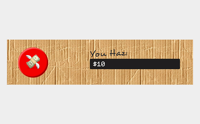
Clicking the button will cause the display to get updated with the new amount of 'money' the user has collected.

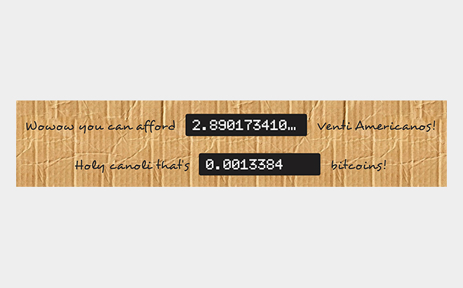
Pieces on the page that were modified upon the click of the 💸 button. The amount of venti-sized Starbucks Americano beverages and the amount of bitcoins that can be afforded are displayed.

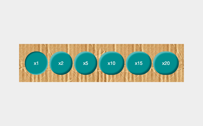
Fulfilled the need to have buttons that affected the rest of the page somehow. Clicking on a multiplier multiplies the amount of money the button generates.
Origin & Goals
I do think that these “no applicable use in the real world” projects are an occasional necessity. By having fun and excluding strict deadlines, creativity flows and allows collaborators to experiment and try things they normally wouldn’t have a chance to work with. This project originated as a way to make an exciting alternative to a more tame in-class assignment. The assignment called for:
- An element on the page that changed according to a button click
- 6 circles that were acted upon by JavaScript
Since partners were allowed, I decided to collaborate with another developer (Matt). His infamous addiction to Starbucks and love of Bitcoin may have had an influence on what direction this project took.
Development
The Money Machine fulfilled the requirement of modifying the DOM by updating the content of specific page elements (any numerical values in the black boxes) when the 💸 button was clicked1. (Implemented by Matt)
Basic page interaction was achieved by having the multiplier buttons available on the bottom of the cardboard portion of the webpage. By clicking one of these, the user is able to change a variable that impacted how many dollars were added to the total count. The buttons also had a CSS class added or removed to indicate which was currently selected2. (Implemented by Emily.)
Only simple math was needed in order to find out the quantity of Venti Americanos3 you could buy with the money you got from clicking on the 💸 button. The price of the coffee is hard-coded, since Starbucks doesn’t have a public API we can tap into. (Implemented by Matt.)
Converting the money earned into Bitcoin was a chance to involve an external API4. Since the value of Bitcoin changes minute to minute, I felt that it was appropriate to fetch the information from an outside source. This value is only updated as the page loads initially, since I didn’t think a live-updating of the exchange rate was necessary for a good experience. For reference, the value returned from the API is under the cardboard portion of the page in “fine print”5. (Implemented by Emily.)
Design
The cardboard box aesthetic was initially brought up by me, inspired by my readings of Calvin and Hobbes. (Have you seen what they could do with those boxes!?) It gave us a chance to play around with some novelty design, especially concerning the typography. This design that was clearly not in line with on-trend modern and minimalist websites also allowed us to play with CSS effects we don’t usually run into (such as box-shadow and transform). (CSS primarily implemented by Emily.)
Improvements
- This code is definitely not optimized at the moment and would seriously benefit from refactoring
- I want to find a way to call the Bitcoin API without getting a
[DEPRECATED]error in the console - Since this isn’t aligning with UX best practices anyway, we were going to get some sounds and other effects added in for button clicking.
- The exchange rate of Bitcoin to USD could be updated to change every minute or so
- Needs more cowbell