From Here to There - New Haven Hackathon 2016

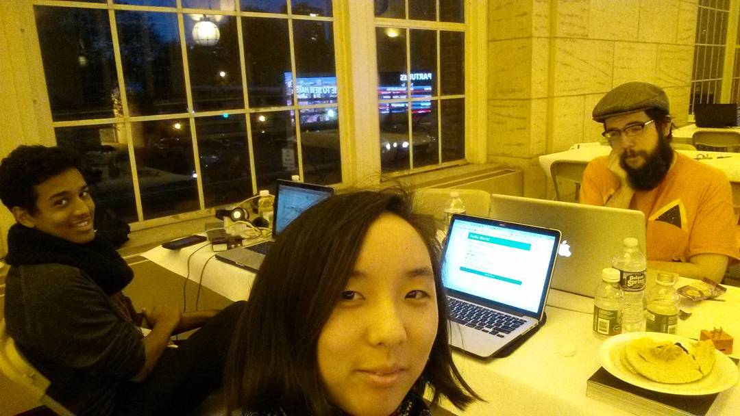
I went to the New Haven hackathon last weekend and worked with 3 other cool people to build a web app!

The Project
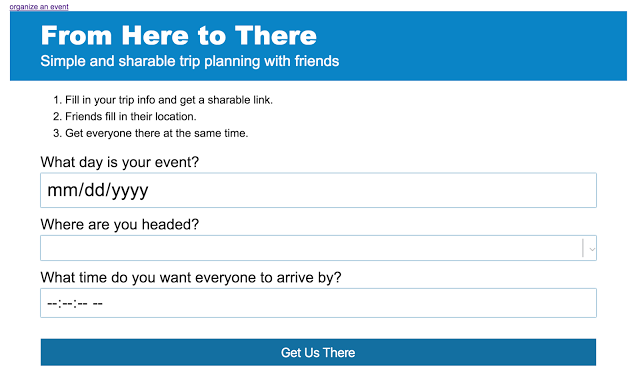
For our project, we built an app called “From Here to There”. From Here to There is a trip planning tool that allows users to easily plan and coordinate group activities. The “Organizer” first sets the meetup location (a train station), date, and time. The organizer then gets a link to send to participants with that information filled in. The participants enter their departure location and are given the last train that will get them there on time. The app won a prize for being the best app that incorporated a sponsor (scriptr) service.
There’s a bunch of things to fix, such as a better user experience and the extended train schedule is pretty funky. Plus, the detect location feature isn’t finished yet. But! There was about 29 hours in total to finish the project, so we’re extremely proud about the fact that it actually that works. I definitely have plans to continue working with the team to improve and market it more.
The slides we used for our presentation at the hackathon are here: https://docs.google.com/presentation/d/1gzuCubRaOQYThq2Z6GLYX9FpUaGOzx5r6JIKfxzWpLA/edit#slide=id.gd9c453428_0_16
Development
The web app was built using AngularJS, HTML, CSS, Scriptr, and Google Maps Directions API. The HTML/CSS and JS were developed concurrently. As the JS was being initially researched and written, the HTML layout with all the necessary elements was built out. Development moved from the ‘Organizer’ screen and then to the ‘Participant’ screen.
The biggest initial block in development was the CORS permissions. Since the localhost testing environment wasn’t allowed, initial testing showed nothing being returned from scriptr.
Note: If the app does not work, it is due to the Maps API token expiring.
Design
One of the key features of the app is the fact that it lacks visual clutter and has a good user experience.
Organizer Screen - The three organizer fields were featured the most prominently, as they will be the only thing a returning user needs to use. We added icons to the right side of each field, although it seems this actually confused users more (they thought the icons were clickable).
Participant Screen - Since the sole input need from the participant is their location, the input area for that information is emphasized in a blue box, separating it visually from the rest of the content. The changing information (train terminal, time, and date) is bold to allow the user to scan it more easily.
Since this application was only tested in Chrome, there are definite differences in how the input fields are handled between browsers. Some contain specific structure for how dates and time are formatted while others do not. Due to lack of time, we were not able to make accommodations for the differences.
The People

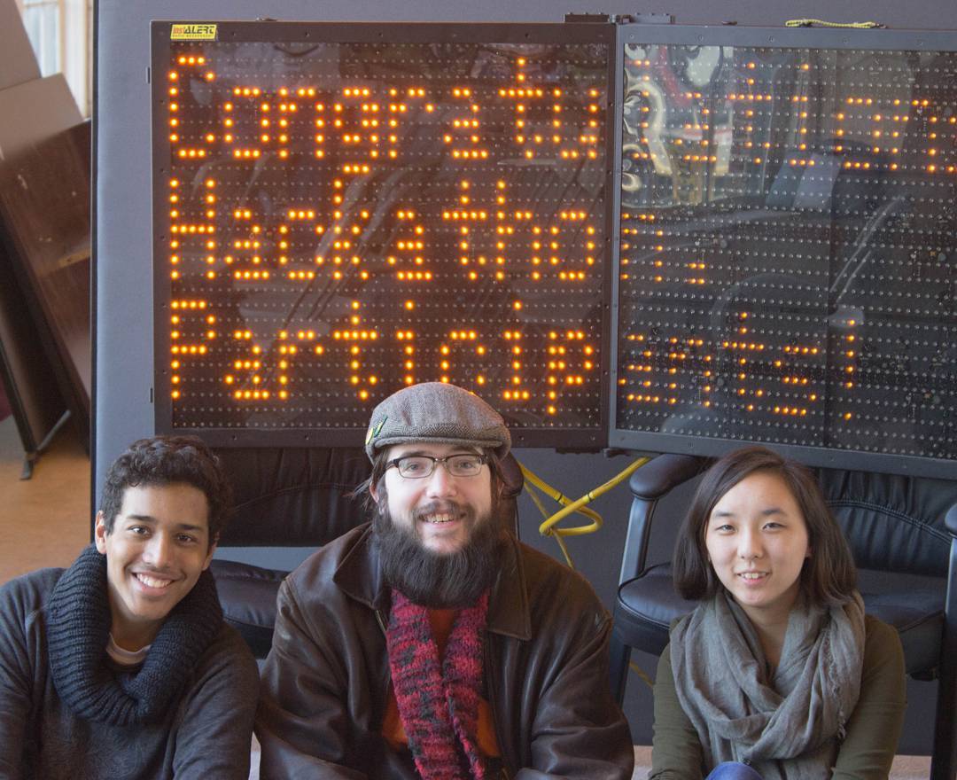
- I (far right) came up with the original concept and worked on the frontend design and user experience (HTML & CSS). I’m a junior concentrating in website design & development within UConn’s DMD program.
- Victor (center) worked on the ‘logic’ and deeper frontend development (AngularJS).
- Gabe (far left) helped with research support, copy editing, and did most of the presentation at the event. He’s a sophomore concentrating in digital media strategies for business within UConn’s DMD program.
- Mike (not pictured) helped us with figuring out the API to use.
Finally, a Word on Hackathons
Despite what the name would suggest, a hackathon isn’t about literal (colloquial) security-related hacking. Rather, it’s about hurriedly making (hacking together) a project using technologies and having something you can say you did after a weekend. Seeing what technology is available and what can be made in a single weekend is also a huge benefit to attending these events. (Prizes may be made available depending on the hackathon, but winning one isn’t the point of participating.)
Whenever the Stamford hackathon comes back, I would highly encourage everyone to have a look and consider just observing. You don’t need to be a developer to contribute. In fact, having someone dedicated to research and presenting is extremely helpful so that the developers can concentrate on those pesky bugs (um, I mean, “features”) that never seem to stop popping up. Designers are also important for the project if usability is an important ‘selling point’. This ended up being relevant for both hackathons I have participated in and won a prize in.
Edited on 8/15/2017, added more technical details about the application.
View Web App See Source Code