The Box Project

Origin & Goals
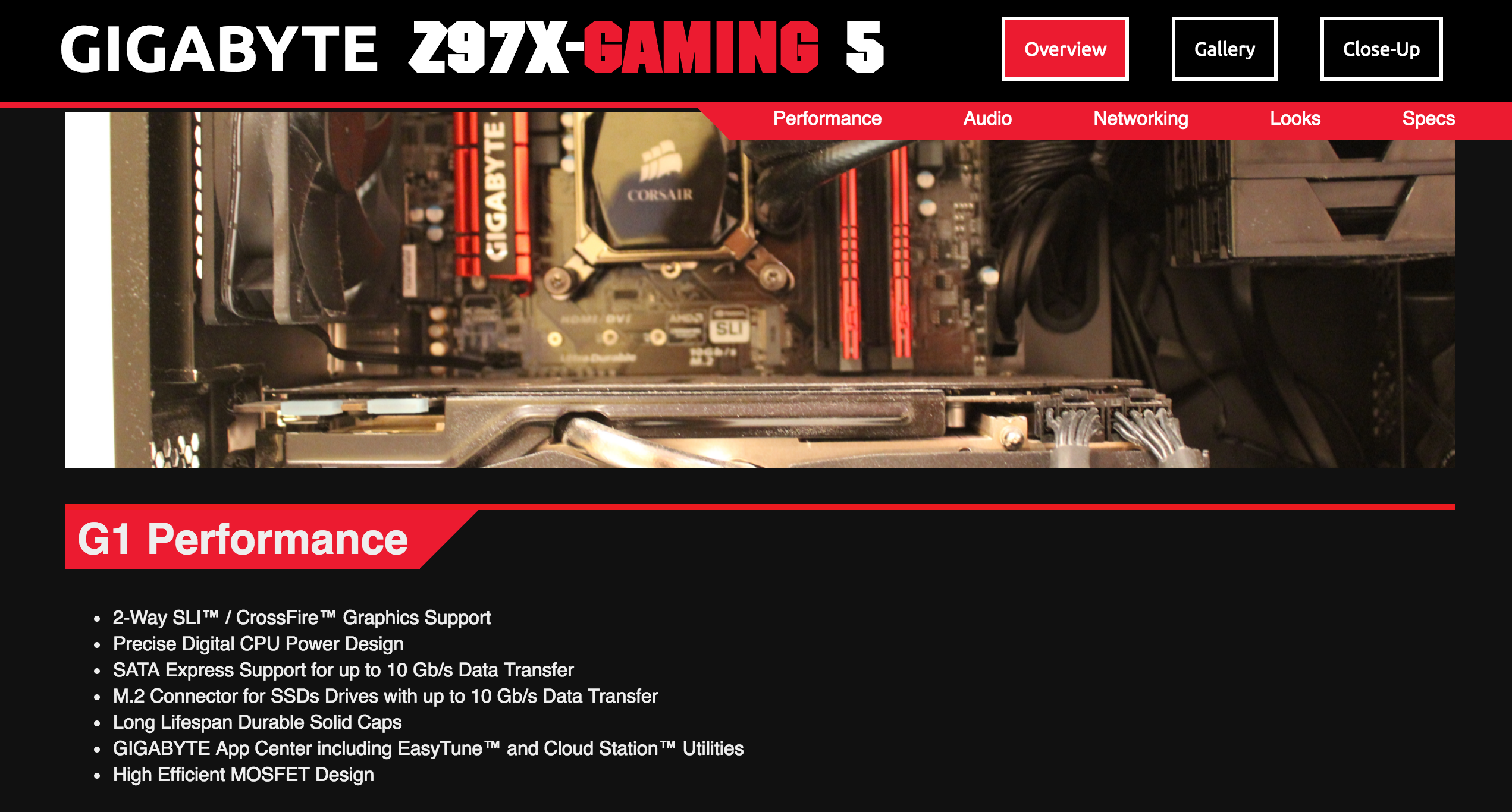
Originally, this project was made as a class project using these specifications. I decided to use the box for my ‘gaming’ motherboard because I thought it would present the opportunity to experiment with different design.
Development
This was the first real website I had coded completely from scratch for a while. Some features included offset jump links as well as the CSS tricks to have the slanted headings appear properly.
The jump links needed to be coded above the actual headers, and had a top offset of -75 so that the top menu would not obscure the other items. This effect is more visible on devices with smaller screens.
The slanted elements of the design were actually created with empty elements that had CSS applied so they looked like solid shapes. Positioned after the end of the main text was one square rotated by 45 degrees, the same color as the heading background. On top of it (an element with a higher z-index) was a black square, matching the black background color and obscuring the rest of the square. While I believe this solution was quite “hacky”, it seems to be the most elegant solution for now. Plus, it worked.
Working with these techniques was a valuable experience. I had only worked with the jump link feature before within WordPress themes that did all the heavy work for me. The CSS slant trick gave me a chance to work with CSS on a deeper level than usual, and I’ve been able to use similar strategies for client websites ever since.
Design
Much of the design was dictated by the design of the original box, which already had an “edgy” design with aesthetic flourishes (such as the headers with slanted backgrounds). The red color was sampled from the official website. I personally think it’s too bright, but decided to stick with it for authenticity’s sake.
Of course, print design doesn’t translate directly to web design, so some other liberties were taken in the rest of the design. For instance, the lines extending from each header were originally shorter. but I thought they would help distinguish each section from the others.
Improvements to be Made
- Sizing of items was done using non-relative units. This problem is trickier to alleviate than usual, due to how the slanting header design was set up.
- The images weren’t compressed at all, leading to some atrocious loading times.